 中文
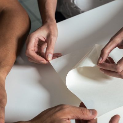
Sample books are the least glamorous objects in the print supply chain. They live in sales bags, get dog-eared in studio drawers, and are usually judged on how quickly a designer can find the right stock. Ball & Doggett has decided to make one worth keeping: The Bright White Album, a limited-edition self-adhesive swatch produced to mark more than a decade of Bright White Felt distribution in Australia.
The concept is deliberate. The piece takes its name and its design language from one of the most influential record sleeves ever printed, and uses that reference to do something a conventional swatch book cannot: make a material story memorable. Only 150 individually numbered pressings have been produced, each presented in a sleeve, with allocation by ballot.
Underneath the conceit is a straightforward product family. The Bright White Album showcases the complete Bright White Felt range through four distinct constructions, all unified by the same felt finish. Ball & Doggett has been the exclusive Australian distributor of the stock for the past decade, and describes Bright White Felt as one of the market’s most recognised premium label materials — long favoured by wine, spirits and craft beverage brands for its tactile appeal and reliable performance.
Josh Gleeson, marketing executive at Ball & Doggett, explained the design logic in product terms: the White Album became iconic because simplicity became its signature, and the company wanted to explore whether a single label finish could do the same. That is a more interesting proposition than it first appears. In premium beverage labelling, the differentiator is rarely the print; it is the surface. A felt-textured uncoated white gives a brand a tactile signature that survives handling, condensation and the low-light conditions of a bar or a restaurant table.
Chris Jackson, national manager for self-adhesive at Ball & Doggett, positioned the piece around the family rather than a single grade, describing Bright White Felt as one of the market’s most recognised premium label materials and describing the album as an opportunity to showcase the complete family in a format that celebrates both its legacy and its versatility.
From a print-industry standpoint, the campaign is a useful case study in how material suppliers are adapting to a market where specification decisions have moved. A decade ago, a converter or a brand’s print buyer chose a stock from a physical swatch and moved on. Today the specification conversation often involves a designer working in a studio, a brand team reviewing mock-ups, and a converter asked to prove that the chosen material will run at speed on a given press with a given adhesive. Supplier marketing has to speak to all three, which is why objects that live in a studio rather than a sample case carry disproportionate influence.
There is a commercial logic to the scarcity as well. Producing 150 numbered pieces and allocating them by ballot generates a level of attention that a standard swatch run cannot, at a fraction of the cost of an advertising campaign. It also creates a reason for designers and brand owners to engage with the supplier directly, which is where specification conversations begin.
The practical questions a converter will ask are the ones the campaign does not answer: how the four constructions differ in caliper and adhesive performance, which are suitable for chilled and wet environments, and what the press-run implications are for each. Those details live in the technical data, not the sleeve. But the sleeve is what gets the sample into the studio in the first place.
Whether a label material can carry the same cultural weight as an album cover is arguable. What is not arguable is that the premium beverage segment buys on feel as much as on print, and that the suppliers who make their materials tangible — literally, in the hand — tend to be the ones written into specifications. Ball & Doggett has bet ten minutes of a designer’s attention on that principle, and packaged the bet in a sleeve.
There is a quiet commercial logic to material suppliers investing in objects of this kind. In the self-adhesive market, the specification decision is made earlier than most suppliers can reach. It happens in a design studio, in front of a mock-up, often months before a converter is asked to quote. A supplier that owns a place on that studio shelf has a structural advantage over one that only appears at the quotation stage. Swatch books, sample wallets and, occasionally, elaborate limited editions are all attempts to occupy that space.
The trade-off is that beautiful objects can obscure technical reality. A felt-finish uncoated white behaves differently from a gloss laminate under the same press conditions: ink laydown, drying, adhesion on curved surfaces and scuff resistance all vary, and the constructions in a family are rarely interchangeable across applications. Designers who specify from a swatch without reference to the technical data sheet frequently hand converters a job that has to be renegotiated. The most useful thing a supplier can do with a campaign like this is pair the object with easy access to the data behind it.
Source: Print21 — https://print21.com.au/ball-doggett-launches-bright-white-album